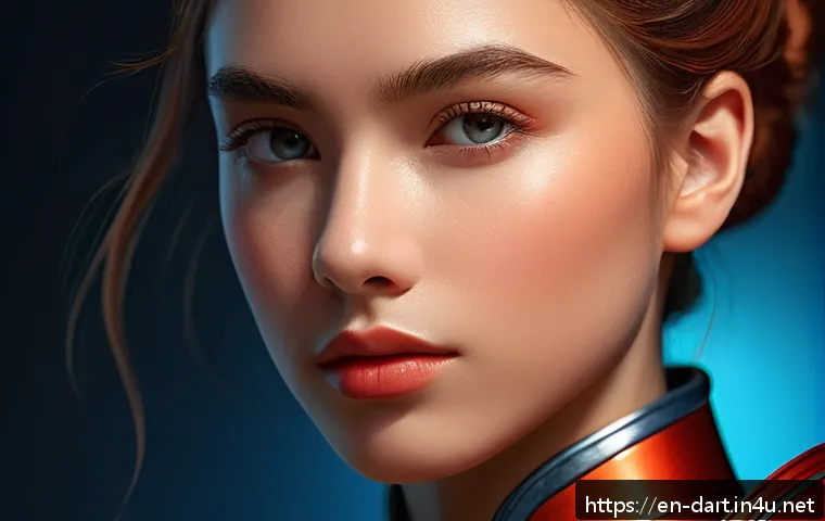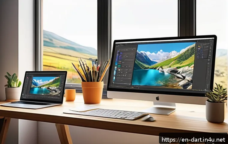
In today’s fast-evolving digital art world, mastering the play of highlights and shadows is more crucial than ever for creating stunningly realistic pieces.

With new tools and techniques emerging regularly, artists have unprecedented opportunities to add depth and emotion to their work. Whether you’re a seasoned creator or just starting out, understanding how light shapes your art can transform a flat image into a captivating visual story.
I’ve spent countless hours experimenting with these elements, and the results have been game-changing. Let’s dive into how you can harness highlights and shadows to bring your digital art to life like never before.
Understanding Light Sources and Their Impact
Types of Light and How They Affect Mood
When you think about lighting in digital art, it’s not just about placing a bright spot somewhere; the type of light you use can completely change the vibe of your piece.
For example, harsh sunlight casts sharp, high-contrast shadows, which can give your art a dramatic, intense feel. On the other hand, soft, diffused lighting creates gentle shadows and highlights, perfect for a calm or romantic atmosphere.
I remember working on a portrait where switching from hard to soft lighting made the character feel so much more approachable and warm. Understanding these nuances helps you tell the story you want through your art’s mood.
Directional Light vs. Ambient Light
Directional light comes from a specific source, like the sun or a lamp, and creates clear highlights and shadows. This kind of light is fantastic for emphasizing form and texture because it sculpts the object visually.
Ambient light, however, is indirect and fills the scene evenly, softening shadows and reducing contrast. Using a mix of these two can add a lot of realism.
For instance, when painting a room, ambient light sets the overall tone, while directional light can highlight a subject or detail. I’ve found that balancing these lights carefully makes my scenes pop without looking overdone.
Practical Tips for Positioning Your Light Source
It might sound obvious, but where your light source is positioned can make or break the realism in your work. Placing light too close or too far, or at awkward angles, can flatten your piece or make shadows unrealistic.
I usually recommend experimenting with three-quarter lighting—where the light hits your subject from a 45-degree angle—because it naturally adds depth and dimension.
Also, consider multiple light sources for complex scenes to mimic real-world environments. Playing around with this setup in your software’s lighting options can be a real eye-opener.
Mastering Shadow Techniques for Depth and Texture
Soft vs. Hard Shadows: When to Use Each
Shadows aren’t just about darkness; their quality tells a lot about the environment and materials. Hard shadows have crisp edges and suggest a strong light source, like midday sun or a spotlight.
Soft shadows, with blurred edges, indicate diffused light or multiple light sources. For example, I once painted a leather jacket and used sharp shadows to emphasize its smooth, shiny texture.
In contrast, a soft shadow around a plush fabric like velvet helps convey its softness. Knowing when to use each type adds tactile realism to your art.
Color in Shadows: Beyond Black and Gray
One of the biggest mistakes I used to make was thinking shadows were just darker versions of the base color or simply black. But shadows often carry color from the environment or reflected light, which can add vibrancy and realism.
For instance, shadows on a sunny street might have blue tones from the sky, while indoor shadows can be warmer because of artificial lighting. Adding subtle color shifts in your shadows can make the difference between a flat image and one that feels alive and natural.
Layering Shadows for Complexity
Rather than painting shadows as a single flat layer, layering different shadow intensities can build complexity and depth. Start with a base shadow, then add secondary shadows to represent occlusion or contact points where light is blocked the most.
I typically use multiple layers in my digital software, adjusting opacity and blending modes to achieve this effect. It’s a bit like sculpting with light and dark, and it really brings out the three-dimensional quality in your art.
Highlight Strategies to Enhance Realism
Capturing Specular Highlights
Specular highlights are those bright spots where light directly reflects off a shiny surface. Getting these right is key for materials like metal, glass, or wet surfaces.
I remember trying to paint a metallic robot and the highlight placement was crucial for making it look polished and believable. Too big or misplaced highlights can ruin the illusion, so observe how light behaves on real objects and mimic those subtle details in your work.
Using Highlights to Guide the Viewer’s Eye
Highlights don’t just add realism—they can also direct attention within your composition. By placing highlights strategically, you can lead the viewer’s eye to important areas, like a character’s face or a key object.
This technique is something I use often when creating storytelling illustrations. Bright spots attract attention naturally, so balancing them with shadows can create a visual path that makes your artwork more engaging.
Highlighting Textures and Surfaces
Different surfaces reflect light uniquely. Rough textures scatter light, creating softer highlights, while smooth surfaces have sharper, more defined highlights.
For example, skin has subtle, diffused highlights that suggest moisture and softness, whereas a polished marble floor will have more distinct, bright reflections.
Playing with highlight shapes and intensities helps communicate these material qualities. Experimenting with brush settings and layer effects can help you capture these nuances effectively.
Color Dynamics in Light and Shadow
Warm vs. Cool Tones in Highlights and Shadows
Using warm colors in highlights and cool colors in shadows can create a beautiful contrast that enhances depth and vibrancy. I often apply this technique subconsciously now, but it’s a powerful way to inject life into your pieces.
For example, a sunset scene with warm golden highlights and cool purple shadows feels much more dynamic and visually interesting than one with neutral colors.
This push and pull of temperature adds emotional weight and realism.
Complementary Colors for Visual Interest
Pairing complementary colors between highlights and shadows can make your art “pop” in a subtle but effective way. Think of orange highlights against blue shadows or red highlights with green shadows.
This contrast increases visual tension and draws viewers in. I’ve experimented with this on landscapes, where the natural color contrasts enhance the overall mood and depth.
It’s a technique that can be applied across different styles, from realism to stylized art.
How Color Influences Perceived Light Quality
The color you choose for your light source affects how viewers perceive the entire scene. A cool blue light will give a calm, maybe eerie feeling, while a warm yellow or orange light suggests coziness or energy.
Shadows cast under these lights will also take on different hues. By carefully selecting your light color palette, you can subtly influence the emotional tone of your artwork.
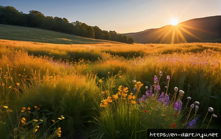
I like to think of color and light as partners working together to tell a story.
Common Mistakes and How to Avoid Them
Overusing Highlights or Shadows
It’s tempting to add a lot of highlights and shadows to show off your skills, but too much can overwhelm the viewer and flatten your piece instead of enhancing it.
I learned this the hard way by initially piling on contrast, which made my art look chaotic rather than polished. The key is subtlety and balance. Sometimes less is more; a few well-placed highlights or shadows can be far more effective than covering everything.
Ignoring Light Direction Consistency
One of the most glaring errors I see in beginner digital art is inconsistent light direction. Shadows going one way while highlights are in another breaks the illusion of depth instantly.
Keeping track of your light source’s angle throughout your composition is essential. I find it helpful to sketch out a simple diagram or use 3D models for reference to stay consistent, especially in complex scenes.
Neglecting Environment Influence on Light
Light doesn’t exist in a vacuum—it interacts with surroundings, bouncing and changing color. Neglecting this can make your lighting feel artificial. For example, a character standing near a red wall might have a subtle red tint in their shadows or highlights.
Incorporating these environmental influences adds a layer of sophistication to your work. I try to observe real-life situations or use photo references to capture these subtle effects.
Tools and Software Features That Help Perfect Light Play
Using Layer Modes to Create Depth
Many digital art programs offer layer blending modes like Multiply, Screen, and Overlay that are perfect for building shadows and highlights. I personally love using Multiply for shadows because it darkens without losing underlying texture, and Screen for highlights to brighten areas softly.
Learning to combine these modes effectively can save you tons of time and produce more natural results than painting with solid colors.
3D Lighting and Reference Models
3D models and lighting simulators have become game-changers. You can pose a figure, set up light sources, and see how shadows and highlights fall in real time.
I started using simple 3D references and noticed a huge improvement in my understanding of light behavior. Even if you don’t want to go full 3D, using these tools as a guide can elevate your 2D work substantially.
Brush Settings for Realistic Highlights and Shadows
Customizing brush opacity, flow, and hardness plays a big role in how natural your light effects look. Soft, low-opacity brushes are great for building up gradual shadows, while harder brushes work well for sharp highlights.
Experimenting with pressure sensitivity on tablets also helps create varied strokes that mimic natural light falloff. I often tweak these settings mid-process to get just the right feel.
| Technique | Purpose | Tips |
|---|---|---|
| Directional Lighting | Defines form and creates strong contrast | Use 45-degree angles for natural depth; combine with ambient light |
| Soft Shadows | Creates gentle transitions and realism | Use low opacity brushes and layer multiple shadows |
| Color in Shadows | Adds vibrancy and environmental reflection | Incorporate ambient colors; avoid pure black shadows |
| Specular Highlights | Shows surface texture and material | Observe real objects; place highlights carefully |
| Layer Blending Modes | Enhances depth without harsh edges | Use Multiply for shadows, Screen for highlights |
Experimenting with Mood Through Light and Shadow
Creating Drama with High Contrast
High contrast between bright highlights and deep shadows can instantly add drama and intensity to your art. It’s a technique used in film noir and horror genres to evoke suspense and mystery.
When I first applied this style to a fantasy character design, the mood shifted from heroic to ominous just by tweaking the lighting. It’s a powerful tool when you want to convey strong emotions or tension.
Soft Lighting for Intimacy and Warmth
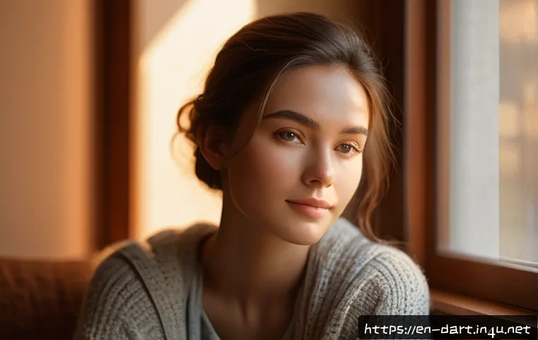
Soft, diffused lighting is your go-to for scenes that require warmth, intimacy, or tenderness. I often use this in portraits or cozy interior scenes. The gentle gradations in light and shadow create a soothing atmosphere that invites viewers in.
In one of my recent pieces, soft light helped express the quiet vulnerability of a character, making the image resonate emotionally.
Using Color Temperature to Influence Feelings
The temperature of your light—whether cool or warm—can drastically change the emotional tone. Warm lights tend to feel inviting and lively, while cool lights can feel calm, eerie, or somber.
I’ve experimented a lot with this when painting environmental scenes; a cold blue dawn versus a fiery orange sunset sets completely different moods. Playing with temperature in your lighting can help you connect with your audience on a deeper level.
In Conclusion
Mastering light and shadow is essential for bringing depth, mood, and realism to your digital art. By understanding how different light sources, shadow types, and color dynamics work together, you can create more compelling and emotionally resonant pieces. Remember, lighting is not just a technical skill but a storytelling tool that shapes how viewers experience your work. Keep experimenting and observing real-life lighting to refine your approach.
Useful Tips to Keep in Mind
1. Always consider the direction and quality of your light source to create natural depth and texture in your artwork.
2. Use color thoughtfully in shadows and highlights to add vibrancy and emotional impact rather than relying on just black or white.
3. Balance your highlights and shadows carefully—overdoing either can make your piece look flat or chaotic.
4. Experiment with different lighting setups, like three-quarter lighting or multiple light sources, to bring complexity and realism.
5. Utilize digital tools such as layer blending modes and 3D references to enhance your lighting effects efficiently.
Key Takeaways
Consistent and purposeful lighting is crucial for believable and engaging digital art. Pay close attention to how light interacts with surfaces and environments to avoid common pitfalls like inconsistent shadows or unnatural color casts. Embrace subtlety in highlights and shadows to maintain balance and avoid overwhelming your composition. Lastly, leveraging software features and real-world observation will significantly elevate the quality and authenticity of your work.
Frequently Asked Questions (FAQ) 📖
Q: How do highlights and shadows improve the realism of digital art?
A: Highlights and shadows are essential because they mimic how light interacts with real-world objects, adding depth and dimension to your artwork. When you carefully place highlights where light naturally hits and shadows where it’s blocked, your piece gains a three-dimensional feel, making it look more lifelike.
From my experience, even subtle adjustments in light and shadow can dramatically change the mood and believability of an image.
Q: What tools or techniques are best for mastering highlights and shadows in digital art?
A: I’ve found that using layer modes like Multiply for shadows and Overlay or Screen for highlights works wonders. Many digital art programs offer brushes with adjustable opacity and softness, which help create smooth gradients between light and dark areas.
Experimenting with different lighting angles and color temperatures also adds realism. Personally, combining these tools with references or 3D lighting models has been a game-changer in understanding how light behaves.
Q: How can beginners start practicing effective use of highlights and shadows?
A: Start simple—choose basic shapes like spheres or cubes and practice shading them under a single light source. This builds a strong foundation in recognizing how light affects form.
I recommend sketching and shading traditionally or digitally, then comparing your work to real-life objects or photos to see if the light and shadow placement feels natural.
Over time, applying these principles to more complex subjects becomes second nature and truly enhances your artwork.