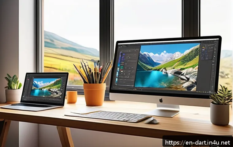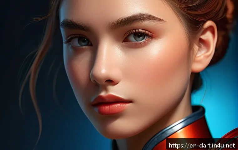
In today’s fast-evolving digital art world, mastering character coloring techniques has become essential for artists aiming to stand out. With new tools and software updates rolling out constantly, staying ahead means blending creativity with the latest tech trends.
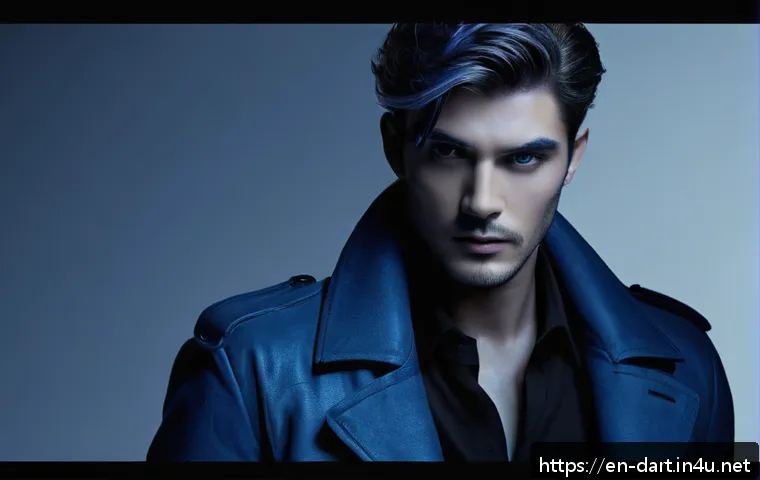
Whether you’re a beginner or looking to refine your skills, understanding how to bring your characters to life through color can transform your artwork dramatically.
I’ve spent countless hours experimenting, and the difference a well-executed coloring technique makes is truly game-changing. Let’s dive into these methods together and unlock your art’s full potential.
Understanding Color Foundations for Characters
Choosing the Right Color Palette
Selecting a color palette is more than just picking favorite hues; it sets the entire mood and personality of your character. When I first started experimenting, I noticed that limiting my palette to 3-5 colors helps maintain harmony and consistency.
Warm colors like reds and oranges can evoke energy or passion, while cooler tones such as blues and greens bring calmness or mystery. It’s important to consider the character’s backstory and role—are they a fiery hero or a calm strategist?
Also, using color theory basics like complementary and analogous colors can elevate your design by creating visual balance. Don’t hesitate to test out different palettes digitally before settling on one; sometimes unexpected combos can surprise you.
Base Color Application Techniques
Applying the base color evenly is crucial since it forms the canvas for all subsequent shading and highlights. From my experience, using a large soft brush at low opacity gives a smooth foundation without harsh edges.
Some artists prefer solid blocks of color first, then blending later, while others paint with semi-transparent layers from the start. Both methods work, but layering with transparency allows for more control over depth and tone.
Also, consider the character’s environment lighting when choosing your base color’s brightness and saturation. For instance, a character under moonlight might have a cooler and desaturated base compared to one in bright sunlight.
Using Color to Express Emotion
Colors have psychological effects that can subtly convey your character’s emotions or traits. I once colored a character with muted blues and grays to reflect their melancholic personality, and viewers immediately picked up on the mood without needing extra context.
Vibrant, saturated colors often suggest confidence or youthfulness, while desaturated or dark tones can imply seriousness or danger. Don’t overlook the power of small accent colors, either—a single pop of red in the eyes or clothing can draw attention and communicate intensity or passion.
Experimenting with these emotional cues through color can breathe life into your characters beyond just their shapes and lines.
Mastering Light and Shadow Dynamics
Identifying Your Light Source
Pinpointing where your light source originates is the foundation for realistic shading and highlights. In my workflow, I always sketch a rough directional arrow or mark to remind myself where light hits the character.
This helps maintain consistent shadows and avoid confusing lighting, which can break immersion. Natural light tends to be soft and diffused, while artificial lights like neon or lamps create sharper shadows and unique color casts.
Remember to think about multiple light sources too—adding rim lights or fill lights can add depth and drama but requires careful observation to keep things believable.
Layering Shadows for Depth
Shadows aren’t just black or gray patches—they have color and intensity that can drastically affect the character’s volume and realism. I like to use multiply layers with low opacity to build shadows gradually, starting with broad soft shadows and then adding sharper, smaller shadows to define details like folds or facial contours.
Cooler tones often work well for shadows, giving a natural contrast to warmer base colors. Avoid making shadows too harsh unless the scene demands it; subtle gradients usually make your character feel more three-dimensional and alive.
Highlighting for Visual Impact
Highlights bring your character’s skin, hair, and clothing to life by simulating how light bounces off surfaces. When I add highlights, I focus on the parts that catch the most light—cheeks, nose bridge, lips, and glossy materials like eyes or leather.
Using a small brush with a bright but not pure white color creates a natural glow. For shiny or wet surfaces, sharper and more concentrated highlights work best.
Additionally, playing with colored highlights—such as warm orange tones for sunlight or cool blues for moonlight—can enrich the atmosphere and storytelling in your artwork.
Techniques for Texture and Detail Enhancement
Brush Selection and Customization
Choosing the right brushes can transform a flat digital painting into a textured masterpiece. I often customize brushes in my software to mimic real-world textures like skin pores, fabric weave, or rough leather.
For instance, a speckled brush works wonders for freckles or dirt, while a soft round brush is ideal for smooth skin blending. Experimenting with pressure sensitivity and scatter settings can also add variety and organic feel.
Don’t hesitate to combine multiple brushes within a single piece; layering different textures enriches the visual complexity and keeps viewers engaged.
Adding Fine Details with Precision
Fine details can make or break your character’s believability. Hair strands, wrinkles, or subtle blemishes all contribute to uniqueness and realism. When zoomed in, I switch to smaller brushes and steady strokes, sometimes using a graphics tablet for better control.
Patience is key here; rushing details can lead to messy or unnatural results. Also, using layers to isolate details allows easy tweaking without disturbing the overall composition.
Remember, less can be more—strategic placement of fine details draws the eye without overwhelming the viewer.
Incorporating Environmental Effects
Environmental elements like dust, rain, or light reflections can add context and mood to your character. I like to use textured brushes or overlays to simulate these effects subtly.
For example, soft white speckles can mimic dust particles floating in the air, while light blue strokes on edges suggest water droplets or humidity. These details not only enhance realism but also create a narrative around your character’s world.
Experimenting with blending modes like screen or overlay helps integrate these effects naturally into your artwork.
Optimizing Workflow with Software Tools
Utilizing Layer Modes Effectively
Layer modes are powerful yet often underused features that can speed up coloring and add complexity. I rely heavily on multiply for shadows and overlay or soft light for highlights.
These modes let you paint on top of base colors without losing detail or needing complex blending. Experimenting with less common modes like color dodge or difference can produce interesting effects, especially for magical or sci-fi characters.
Keeping your layers organized with clear names and grouping also saves time and reduces frustration during revisions.
Shortcut Keys and Custom Workspaces
Mastering shortcut keys is a game-changer in speeding up your digital art process. I customized my key bindings to fit my personal workflow, such as quick toggles for brush sizes, undo, and switching between layer modes.

Many software programs also allow creating custom workspaces tailored to character coloring, placing frequently used tools within easy reach. This setup minimizes distractions and keeps your focus on painting rather than navigating menus.
Investing time in learning these shortcuts pays off big in efficiency and creative flow.
Leveraging Reference and Color Sampling Tools
Using reference images and color sampling can drastically improve accuracy and consistency. I keep a palette of sampled colors from my references handy throughout the painting process.
This helps maintain color harmony and realistic tones, especially for skin and fabric. Some programs offer color palettes extracted automatically from photos, which can be a huge time saver.
Additionally, toggling reference windows side-by-side with your canvas allows constant comparison and fine-tuning of your work. This habit has helped me avoid color mismatches and achieve more polished results.
Balancing Style and Realism in Character Coloring
Stylized vs. Realistic Approaches
Deciding between a stylized or realistic coloring approach depends heavily on your project goals and personal style. I’ve dabbled in both, and each has its rewards and challenges.
Stylized coloring allows for exaggerated colors, bold contrasts, and playful details, which can make characters more expressive and memorable. Realistic coloring requires careful observation of light, texture, and anatomy, often demanding more subtlety and patience.
Blending the two can yield fresh results—using realistic shading with slightly exaggerated colors adds vibrancy while keeping believability.
Expressing Personality Through Color Choices
Color can communicate personality traits as much as facial expressions or poses. For example, a character with a calm and collected demeanor might be dressed in cool blues and purples, while a rebellious one could wear sharp reds or neon accents.
I often brainstorm color stories alongside character backstories to ensure coherence. This approach helps me create designs where color reinforces narrative and emotional impact.
Don’t shy away from breaking color rules if it serves your character’s unique identity—sometimes unconventional palettes make the most lasting impression.
Maintaining Consistency Across Multiple Pieces
When working on a series or animation, keeping color consistency is vital. I create swatch libraries and save my palettes for reuse to avoid subtle shifts that confuse viewers.
Consistency also applies to lighting and shadow style; changing these drastically between pieces can disrupt the character’s visual continuity. I recommend setting up templates or guidelines before starting large projects to streamline color management.
This practice has saved me countless hours and ensured my characters feel cohesive no matter how many scenes they appear in.
Essential Tips for Final Touches and Presentation
Refining Edges and Silhouettes
Sharp and clean edges give your character a polished look, while intentional softness can add atmosphere or focus. I zoom in during final stages to clean up jagged lines or stray pixels, which significantly improves professionalism.
Silhouettes are equally important—testing your character in pure black shape helps check readability and impact. A strong silhouette ensures your character is instantly recognizable, even at a glance or from a distance.
This is especially useful for game or animation design where clarity matters.
Color Grading and Overall Mood Adjustment
Applying a subtle color grade over your finished piece can unify tones and enhance mood. I usually add a soft gradient map or photo filter layer to tweak warmth, contrast, or saturation.
For example, a cooler blue tint can evoke a nighttime scene, while warmer orange hues suggest sunset or coziness. These adjustments help your character blend seamlessly into their environment or story context.
Be careful not to overdo it—small, gentle shifts often work better than dramatic changes.
Preparing Artwork for Sharing and Printing
Before sharing or printing, proper file preparation ensures your colors look as intended. I convert my files to the correct color profile (usually sRGB for web and CMYK for print) and double-check resolution and size.
Exporting in lossless formats like PNG preserves quality, while JPEG compression can degrade colors. Including a version with transparent backgrounds is useful for overlays or merchandising.
Lastly, adding a watermark or signature protects your work online without distracting from the art. These finishing steps reflect professionalism and respect for your creative output.
| Technique | Recommended Tools | Key Benefits | Common Pitfalls to Avoid |
|---|---|---|---|
| Color Palette Selection | Color Wheel, Adobe Color, Coolors | Creates mood, ensures harmony, reinforces character traits | Using too many colors, ignoring color theory, inconsistent palettes |
| Shadow Layering | Multiply Layer Mode, Soft Round Brushes | Adds depth and realism, defines volume | Overly harsh shadows, ignoring light source direction |
| Brush Customization | Custom Brushes, Pressure Sensitivity Settings | Enhances texture, adds natural feel | Using same brush for everything, lack of variety |
| Layer Modes Utilization | Multiply, Overlay, Soft Light | Speeds up workflow, enriches color interactions | Misuse causing unnatural colors, cluttered layers |
| Final Color Grading | Gradient Maps, Photo Filters | Unifies tones, sets atmosphere | Over-saturation, loss of original color intent |
Conclusion
Mastering color foundations for characters is a transformative step in bringing your creations to life. By thoughtfully selecting palettes, understanding light and shadow, and refining textures, you create depth and emotion that resonate with viewers. Remember, practice and experimentation are key to finding your unique style and voice. Embrace the process and watch your characters evolve beyond mere drawings into vivid personalities.
Helpful Tips
1. Always start with a limited color palette to maintain harmony and avoid overwhelming your design.
2. Use layering techniques with varied opacity to build realistic shadows and highlights.
3. Customize your brushes to add natural textures that enhance character details.
4. Organize your layers and utilize shortcut keys to streamline your workflow.
5. Keep consistent color schemes across multiple artworks to maintain character identity and continuity.
Key Takeaways
Establishing a clear light source and applying shadows thoughtfully are essential for realistic depth. Choosing colors that reflect your character’s personality adds emotional impact and storytelling power. Leveraging digital tools like layer modes and custom brushes not only improves efficiency but also enriches the visual complexity of your work. Finally, finishing touches such as clean edges and subtle color grading elevate your art to professional standards, ensuring your characters stand out with clarity and style.
Frequently Asked Questions (FAQ) 📖
Q: uestions about Character Coloring TechniquesQ1: What are the best tools for beginners to start learning character coloring?
A: From my experience, beginners benefit most from user-friendly software like Procreate or Clip Studio Paint. These programs offer intuitive brushes and layering options that make experimenting with colors less intimidating.
Starting with basic tools such as flat coloring and simple shading helps build confidence before moving on to advanced techniques like blending modes and texture overlays.
Don’t rush—practice with what feels comfortable, and gradually explore new features as you get more comfortable.
Q: How can I make my character colors look more dynamic and realistic?
A: Adding depth to your colors is key. I usually recommend working with multiple layers to separate base colors, shadows, highlights, and ambient lighting.
Observing real-life light behavior can transform flat colors into vibrant, believable skin tones or fabrics. Also, try incorporating subtle color variations rather than sticking to one hue—warm shadows or cool highlights can really bring your character to life.
Using references and experimenting with opacity and blending modes helped me achieve a much richer look in my artwork.
Q: How do I keep up with the latest coloring trends and tools in digital art?
A: Staying updated requires a mix of curiosity and community engagement. I follow top digital artists on social media platforms like Instagram and TikTok, where many share tutorials and speedpaints showcasing new styles and techniques.
Participating in art challenges and forums such as ArtStation or DeviantArt also exposes you to current trends. Additionally, subscribing to newsletters from software developers ensures you don’t miss important updates or new features.
Personally, setting aside regular time to explore these resources has kept my skills fresh and my art evolving.