Learn a repeatable workflow for creating appealing deformed digital characters, from proportion planning and silhouette design to color and rendering.

Includes software and tablet selection criteria for different budgets and goals.
How to Create Deformed Digital Characters: A Practical Workflow and Tool Selection Guide
Start by choosing a deliberate proportion system, then test the character’s silhouette before adding detail or rendering. You do not need premium software or a display tablet to begin, but better tools can be worth paying for when they reduce friction in your regular workflow. Deformed character art works because it exaggerates selected features—such as the head, eyes, hands, or pose—while simplifying anatomy. The goal is not to copy one “correct” chibi ratio, but to make every design choice feel consistent. A layer-based illustration workflow also makes revisions much easier when you change poses, costumes, expressions, or colors. Choose digital art software, drawing tablets, brush packs, and courses based on the type of work you actually plan to produce.
At a Glance
- Build the character around a clear proportion guide and a readable silhouette before rendering.
- Free digital art software can support practice, while paid tools may help when your workflow needs smoother editing, export, or device options.
- Check pen pressure, stabilization, portability, layers, and commercial-use rights before choosing tools or assets.
| Setup Type | Best Fit | What to Compare | Ongoing Consideration |
|---|---|---|---|
| Entry-Level Setup | Hobby practice, first character icons, simple social posts | Basic layers, brush stabilization, pen pressure support, easy export | May feel limiting if you need frequent revisions or complex files |
| Advanced Setup | Client work, character sheets, repeated production, detailed illustration | Layer management, device compatibility, shortcut workflow, file and export options | Software subscriptions, upgrades, and asset licenses may need review |
| Display Tablet | Artists who prefer drawing directly on the screen | Portability, pen feel, pressure support, screen workflow | Compatibility and long-term workflow comfort should be checked |
| Pen Tablet or Mouse | Artists working at a desktop or learning core digital drawing habits | Hand position, shortcut access, pressure support, available desk space | A pen tablet can offer a different learning curve from direct-on-screen drawing |
Build a Clear Stylized Character Before Rendering
Start With One Visual Concept and One Personality Trait
The quickest way to make a deformed character feel intentional is to begin with one visual concept and one personality trait. For example, decide whether the character should feel energetic, shy, serious, playful, elegant, or awkward. Then support that idea with a few visible choices: pose, eye shape, clothing shape, hair volume, and hand position.
A small character does not need many details to communicate personality. In fact, too many unrelated accessories can weaken the design. Pick one focal feature first, such as a large head, oversized sleeves, a bold hairstyle, or expressive eyes. Let the remaining elements support that feature rather than compete with it.
Choose a Consistent Head-to-Body Proportion
A proportion guide helps you repeat the same style across multiple characters, poses, and costumes. Decide how the head relates to the torso and legs, then keep that relationship visible in your rough sketch. You can also define how large the hands, shoes, and facial features should appear compared with the head.
There is no universally best head-to-body ratio. The right choice depends on the intended style, audience, and project requirements. A profile icon may benefit from a face-forward design, while a game concept or character sheet may need a clearer full-body structure. The important point is consistency: if one character has tiny hands and short legs, changing those rules without a reason can make the set feel mismatched.
Test the Silhouette at Thumbnail Size
Before drawing eyelashes, fabric texture, or lighting effects, reduce the sketch to a small size and inspect the outer shape. A readable silhouette allows the character to remain recognizable before facial details, shading, or texture are added. Check whether the pose, hairstyle, clothing outline, and major prop still read clearly.
If the silhouette feels flat, adjust the pose before adding detail. Separate the arms from the torso, angle the head slightly, shift the weight, or simplify a large accessory. This is often faster than trying to repair a weak pose with more rendering later.
Select a Digital Art Setup That Matches Your Workflow and Budget
Free Versus Paid Illustration Software: What Changes in Daily Use
Free illustration software can be a sensible starting point for artists learning stylized illustration. Focus on whether it supports the workflow you need: layers, brush stabilization, pen pressure, canvas controls, and usable export options. These are practical features for creating clean line art, flat colors, shadows, and finished social-media assets.
Paid digital art software may be useful when it saves time during frequent production. You may value more convenient layer handling, stronger file options, smoother device integration, or tools that fit client-ready character artwork. Do not assume a paid app will improve your style by itself. It is worth considering when its features remove a repeated obstacle in your actual process.
Before buying, verify current pricing, subscription terms, device compatibility, and export formats on the provider’s official information page. These details can change by provider and region.
Display Tablet, Pen Tablet, or Mouse: Practical Selection Criteria
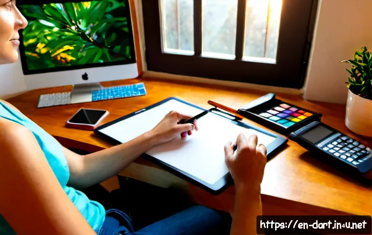
A display tablet may suit artists who prefer to draw directly on the screen. A pen tablet can be practical for desktop workflows and may suit artists who are comfortable looking at a monitor while drawing. A mouse can still help with basic editing, shape placement, and learning software controls, although it does not provide the same drawing feel as a pressure-sensitive pen.
When comparing a drawing tablet, look beyond the product category. Consider pen pressure support, comfort, portability, shortcut workflow, stabilization settings, and compatibility with your preferred software. The best device is the one that supports the work you plan to make consistently, not simply the one with the longest feature list.
When Premium Brushes, Assets, or Courses Provide Real Value
Premium brush packs can be useful when they fit a specific need, such as clean line work, controlled texture, or faster coloring. They are less useful when they become a substitute for basic shape design, color decisions, and pose practice. Start with a small brush set and learn what each brush does before adding more.
An online course may be valuable if it gives you a structured way to practice proportions, silhouettes, expressions, or digital workflow. Reference assets, fonts, and textures can also support client work and product art, but always check the commercial-use rights before including them in paid commissions or products.
A Repeatable Sketch-to-Color Workflow
Create a Simple Construction Sketch
Begin with simple shapes instead of finished anatomy. Use a large circle or rounded form for the head, a compact body block, and simple lines for the gesture. At this stage, focus on balance and expression. A tilted head, bent knees, or a hand near the face can communicate more personality than a perfectly detailed outfit.
Keep the construction sketch on its own layer. This makes it easier to revise proportions without damaging later line art. If you are building a character set, save the proportion guide nearby so you can compare each new pose with the original style rules.
Simplify Facial Features and Anatomy Without Losing Expression
Deformed art is not about removing all structure. It is about choosing which structure matters most. Simplify the nose, fingers, joints, and muscle definition when they do not support the character’s expression. Keep enough information for the pose to read clearly.
For the face, establish a focal point. Large eyes may be the focus, but they need support from eyebrow direction, mouth placement, and head angle. If every feature is oversized, the face can become noisy rather than expressive. Use contrast selectively.
Separate Line Art, Flats, Shadows, and Effects Into Editable Layers
A layer-based workflow makes correction easier. Keep your sketch, line art, flat colors, shadows, and background separate when possible. This lets you test a new palette, revise an expression, or adjust shadow placement without rebuilding the entire illustration.
Use a limited palette of main hues for small characters. Fewer major colors can make the design easier to read, especially for stickers, icons, and thumbnail-sized posts. Add shadows only where they clarify form or separate overlapping shapes. Heavy shading can hide the simple charm that makes a stylized character work.

Avoid the Most Common Stylization Mistakes
Oversized Features Without a Clear Focal Point
Large heads, eyes, hands, and shoes can all work, but they need a hierarchy. Choose the feature that should attract attention first. If every part is exaggerated equally, the viewer may not know where to look. Reduce competing shapes or simplify nearby details.
Detailed Clothing That Overwhelms a Small Character
Small characters have limited visual space. Too many seams, patterns, buttons, accessories, and folds can merge into visual clutter. Start with a clear clothing silhouette, then add only details that support the personality or role. A simple oversized jacket, cape, bag, or hat may communicate more than many tiny decorations.
Colors and Shadows That Reduce Readability
When two adjacent colors are too similar, important shapes may disappear. Test whether the face, hands, clothing layers, and major prop remain separate at a smaller size. If they blend together, adjust the palette or simplify the arrangement.
Shadows should support the form, not cover the character. Keep the light direction understandable, and avoid adding effects that make the silhouette harder to recognize. For stylized art, clarity usually matters more than complex rendering.
Adapt the Design for Different Uses
Profile Icons and Social-Media Stickers
For icons and stickers, prioritize the face, expression, and outer shape. Use larger facial features and fewer tiny details because the artwork may be seen at a small size. Test the image after reducing it, and make sure the main emotion still reads immediately.
Character Sheets for Games, Comics, and Animation Planning
For character sheets, a proportion guide becomes especially useful. Show consistent front-facing, side-facing, or pose variations when the project needs them. Keep key colors, clothing shapes, and signature features stable so another artist—or your future self—can understand the design rules.
Commission-Ready Artwork and Commercial-Use Asset Checks
For commissioned character artwork, clarify the revision scope, complexity, and intended usage before finalizing the work. Production time and commissioning rates vary based on these factors, along with usage rights and artist experience. If you use purchased brushes, fonts, textures, or references, confirm that their licensing allows the intended commercial use.
Organized layers and clean exports can also make revisions easier. This matters when a client requests a color change, a new expression, or a version adapted for a different format.
Selection Criteria and Comparison Summary
Choose your setup based on learning stage, output type, revision needs, drawing comfort, and asset licensing. For hobby practice, a basic layer-capable app and a comfortable input method may be enough. For regular social assets, client projects, or character sheets, smoother layer management, reliable export options, and a workflow-friendly drawing tablet may save time. Buy premium brushes only when they solve a specific visual or production problem, and consider training when you need a clearer practice structure. Before purchasing software, hardware, brush packs, or a course, check the official page for current compatibility, terms, and commercial-use conditions.
In Closing
Appealing deformed characters are built from intentional choices, not from a single fixed ratio or expensive tool. Start with a clear personality, a repeatable proportion guide, and a silhouette that works at a small size. Then use layers, limited colors, and simple shadows to preserve readability. Upgrade your tools when they support the kind of artwork you make often.
Useful Things to Know
Keep a style sheet: Save your preferred head shape, eye style, hand size, and main palette for future characters.
Work small early: Thumbnail tests reveal silhouette and color problems before rendering takes time.
Save editable files: Separate layers make expression, costume, and palette revisions easier.
Review licenses: Commercial artwork may require permission for brushes, fonts, textures, and reference assets.
Important Notes
No drawing tablet, software application, or brush pack is universally best. Pricing, subscriptions, compatibility, export options, and licensing terms can change, so review current provider information before purchasing. The best proportion system and production workflow also depend on the project, intended audience, and the level of revision required.
Frequently Asked Questions
Q1. What head-to-body ratio works best for a deformed or chibi-style character?
A1. There is no single best ratio. Choose one that fits the intended style and keep it consistent across poses, expressions, and costumes. A clear silhouette and stable proportion guide matter more than copying a random ratio.
Q2. Do beginners need a paid drawing app or display tablet to create stylized digital characters?
A2. No. Beginners can practice with tools that support basic layers, usable brushes, stabilization, and export options. Paid software or a display tablet may be worth considering later if they make your regular workflow more comfortable or efficient.
Q3. How much should I budget for a basic digital character art setup or a commissioned character illustration?
A3. Costs vary by software provider, device, region, commission complexity, revision scope, usage rights, and artist experience. Compare current software terms, tablet compatibility, and commission details before making a decision.