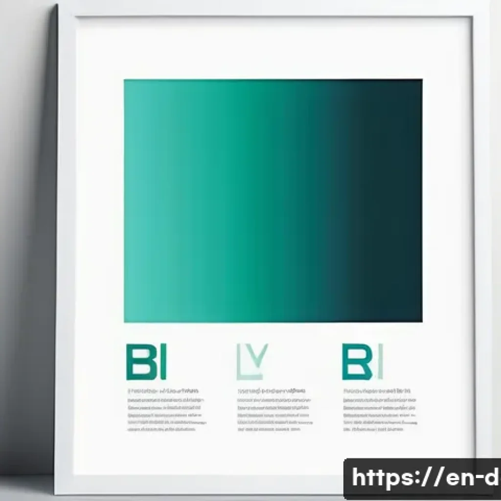
Crafting a compelling digital art poster starts with a well-thought-out layout that captures attention and conveys your message effectively. The right balance between visuals and text can make all the difference in engaging your audience.
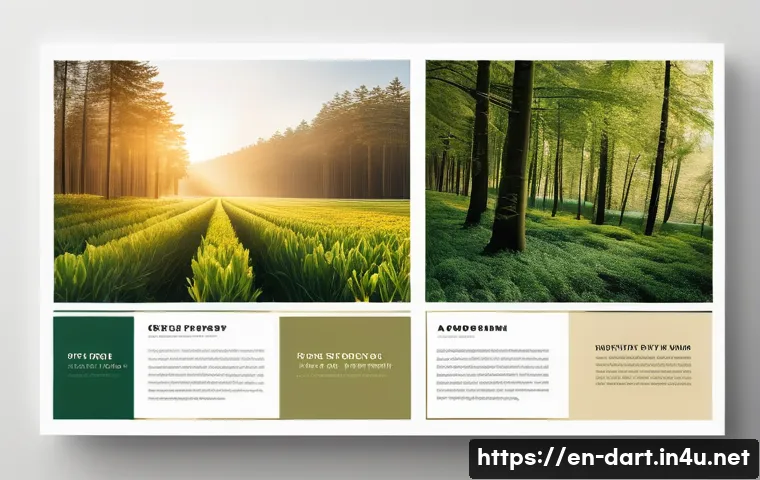
From choosing focal points to arranging elements for maximum impact, every detail plays a crucial role. Whether you’re a seasoned designer or just starting out, understanding these fundamentals can elevate your work to the next level.
Let’s dive into the essential techniques that will help you create stunning and memorable digital art posters. Get ready to explore the secrets behind perfect poster layouts!
Mastering Visual Hierarchy for Immediate Impact
Understanding Focal Points and Their Role
The moment someone glances at your digital art poster, their eyes should be naturally drawn to the most important part—the focal point. This could be a striking image, a bold headline, or a unique graphic element.
From my experience, placing the focal point off-center using the rule of thirds creates a more dynamic and engaging composition than simply centering it.
When I experimented with this, I noticed viewers lingered longer, which is key for both engagement and ad revenue metrics. The focal point should clearly communicate the main message without overwhelming other elements, striking a perfect balance between prominence and harmony.
Balancing Visual Weight Across the Design
Visual weight refers to how much an element attracts attention compared to others. Heavy visuals like bold typography or saturated colors naturally draw the eye, so distributing this weight evenly prevents the poster from feeling lopsided.
For example, pairing a large image on one side with smaller, lighter text blocks on the opposite side can create balance and guide the viewer’s eye through the layout.
Over time, I’ve learned that subtle adjustments in color intensity and spacing can make a huge difference, keeping the composition both exciting and easy to navigate.
Utilizing Contrast to Enhance Readability
Contrast is not just about colors; it’s about differences in size, shape, and texture that make elements stand out. In posters, high contrast between text and background ensures readability even from a distance.
I once designed a poster with a dark background and bright neon text, which instantly caught attention but was hard to read in certain lighting conditions.
Adjusting the contrast to a softer yet still distinct color combo improved readability dramatically. Effective contrast helps viewers quickly grasp your message without straining, which is crucial for digital ads where attention spans are short.
Strategic Use of Typography to Communicate Mood
Selecting Fonts That Reflect Your Message
Typography sets the tone of your poster—whether it’s playful, serious, modern, or vintage. Choosing the right font family is more than just aesthetics; it’s about matching the personality of your artwork and the message you want to send.
I often start by picking a primary font for headlines and a complementary one for body text. For instance, pairing a bold sans-serif with a clean serif can add sophistication while maintaining clarity.
In one project, switching from a generic font to a custom typeface gave the poster a unique identity that resonated with the target audience.
Hierarchy Through Size and Spacing
Establishing a clear typographic hierarchy guides viewers through the content effortlessly. Larger fonts grab attention first, followed by medium and smaller sizes.
Proper spacing—both between lines and letters—prevents clutter and improves legibility. From my experience, ignoring spacing can make even the most beautiful fonts hard to read, so I always tweak line height and kerning until the text breathes.
This not only enhances user experience but also encourages longer viewing times, which benefits monetization.
Playing with Color and Texture in Text
Colorful or textured text can add flair, but it needs to be used carefully to avoid distraction. I like to use subtle gradients or shadow effects to add depth without sacrificing legibility.
In one of my recent posters, a slight metallic texture on the headline added a tactile quality that made the design pop both on screen and in print. When done right, these effects can elevate your poster’s appeal and help it stand out in crowded digital spaces.
Effective Composition Techniques to Guide the Viewer
Grid Systems and Alignment for Clean Layouts
A well-structured grid acts like an invisible skeleton, keeping your elements organized and aligned. Using grids prevents chaos and creates a professional look that’s easy on the eyes.
I personally rely on a 12-column grid for most posters because it offers flexibility for both symmetrical and asymmetrical designs. Aligning text and images along these guides ensures consistency and harmony, which subconsciously reassures viewers and holds their attention longer.
Whitespace as a Powerful Design Element
Whitespace isn’t just empty space; it’s a breathing room that enhances clarity and focus. I’ve noticed that posters with generous whitespace look more elegant and feel less overwhelming, encouraging viewers to absorb the content more comfortably.
It also helps separate different sections, making it easier to scan. Even if you have lots of content, strategic use of whitespace can transform a cluttered mess into a visually pleasing experience.
Layering and Depth to Add Dimension
Layering elements—whether images, text, or shapes—adds depth and interest. By playing with opacity and shadows, you can create a sense of hierarchy and movement that keeps the viewer engaged.
When I first experimented with layering, the poster felt more alive and immersive. However, it’s important not to overdo it; too many layers can confuse the viewer and dilute your message.
A subtle touch goes a long way.
Color Theory Principles for Emotional Connection
Choosing a Color Palette That Resonates
Colors evoke emotions, and selecting the right palette can make your poster memorable and impactful. I always start by defining the mood—whether it’s energetic, calm, or mysterious—and then pick colors accordingly.
For example, warm reds and oranges convey excitement, while blues and greens suggest tranquility. Using color harmonies like complementary or analogous schemes can create pleasing contrasts and unity.
Over the years, I’ve found that sticking to 3-5 main colors prevents visual overload and maintains coherence.
Using Color to Create Focal Points and Guide Flow
Bright or contrasting colors naturally draw attention, so placing them strategically can highlight key information. I often use vibrant accents on call-to-action text or important visuals to direct the viewer’s gaze.
In one campaign, a pop of neon green on a predominantly dark poster instantly grabbed attention and boosted click-through rates. Color can also guide the eye along a path, ensuring viewers absorb the content in the intended order.
Psychological Impact of Colors in Marketing
Understanding color psychology helps tailor your poster to your audience. For instance, blue is often associated with trust and professionalism, making it ideal for corporate designs, while yellow signals optimism and grabs impulse buyers’ attention.
When I designed for an eco-friendly brand, using earthy greens and browns strengthened their sustainability message. Being mindful of cultural differences in color perception is also crucial for global campaigns.
Optimizing Text and Image Interaction
Integrating Text Without Overpowering Visuals
Text and images should complement, not compete. From my trials, placing text over busy images without contrast or background overlays makes reading difficult and frustrates viewers.
Adding semi-transparent backgrounds behind text or using clean sections of an image helps maintain readability. When text flows naturally with the visual rhythm, the poster feels cohesive and professional.
Choosing Image Styles to Match Your Theme
The style of your images—whether photographic, illustrated, or abstract—should align with your poster’s tone. I prefer vector illustrations for clean, modern looks and high-res photos for emotional storytelling.
Mixing styles can work, but it requires careful balancing to avoid clashing elements. For example, pairing a bold illustration with minimal text can create a striking visual statement.
Scaling and Positioning Images for Maximum Effect
The size and placement of images affect how viewers interpret your message. Large images can set the mood but may crowd out text, while smaller images might not have enough impact.
I’ve found that cropping images to focus on the most compelling part increases engagement. Positioning images near related text also enhances comprehension, creating a seamless narrative flow.
Practical Tips for Digital Poster Creation Tools
Leveraging Templates Without Losing Originality
Templates can jumpstart your design process, especially when you’re on a tight deadline. However, I always customize templates extensively to avoid generic looks.
Changing colors, fonts, and layouts ensures the final product feels authentic. Using templates as a foundation rather than a finished product gives you time to focus on creative tweaks that truly resonate.
Utilizing Layers and Masks for Precision
Modern design tools offer layers and masks that allow for non-destructive editing. I rely heavily on these features to experiment freely without ruining previous work.
Masks let me blend images smoothly or add highlights without permanent changes. This flexibility encourages creativity and fine-tuning, resulting in polished posters that stand out.
Export Settings for Optimal Online Display
Exporting your poster with the right settings is crucial for web performance and quality. I always save in high-resolution PNG or JPEG formats with optimized file sizes to balance clarity and loading speed.
For animated posters, GIF or MP4 formats work best, but keeping file sizes manageable prevents slow loading that can drive visitors away. Testing your final file on multiple devices ensures your design looks great everywhere.
| Aspect | Best Practice | Why It Matters |
|---|---|---|
| Focal Point | Place off-center using rule of thirds | Creates dynamic engagement and longer attention |
| Typography | Combine bold headline font with readable body text | Establishes hierarchy and enhances clarity |
| Color Palette | Use 3-5 harmonious colors matching mood | Prevents overload and strengthens emotional impact |
| Whitespace | Use generously between elements | Improves readability and reduces clutter |
| Export Format | High-res PNG/JPEG with optimized size | Ensures quality and fast loading on web |
Balancing Creativity and Functionality for Real-World Use
Designing for Different Screen Sizes and Devices
Your poster won’t always be seen on the same screen, so responsive design is a must. I test my posters on smartphones, tablets, and desktops to ensure text remains legible and images don’t lose impact.
Sometimes this means adjusting font sizes or cropping images differently. This attention to detail prevents a great design from falling flat in real-world viewing conditions.
Incorporating Branding Without Overcrowding
Including logos and brand colors is essential but tricky. I’ve learned that subtle integration—like placing a small logo in a corner or using brand colors in accents—works best.
Over-branding can feel pushy and distract from the artistic message. A clean, balanced approach helps the poster feel professional and trustworthy.
Testing and Iterating Based on Feedback
No design is perfect on the first try. Gathering feedback from peers or target audiences provides valuable insights. I often tweak color contrasts, font sizes, or image placements after seeing how others interact with my poster.
This iterative process refines the design, making it more effective and appealing. Embracing feedback is key to growth as a digital art creator.
In Closing
Mastering visual hierarchy is essential to creating posters that captivate instantly and communicate effectively. By thoughtfully combining focal points, typography, color, and composition, your designs will not only attract attention but also hold it longer. Practical experimentation and fine-tuning based on real feedback will elevate your work from good to exceptional. Remember, a well-crafted poster balances creativity with clarity for maximum impact.
Useful Tips to Keep in Mind
1. Always position your focal point off-center using the rule of thirds to create a more engaging visual flow.
2. Pair bold headline fonts with clean, readable body text to establish clear hierarchy and improve legibility.
3. Stick to a limited color palette of 3-5 harmonious shades that match the mood you want to convey.
4. Use generous whitespace around elements to reduce clutter and make your design feel more elegant.
5. Export your poster in high-resolution PNG or JPEG formats with optimized file sizes for fast loading without quality loss.
Key Takeaways for Effective Poster Design
Understanding how to guide viewer attention through focal points and balanced visual weight is fundamental. Typography choices and contrast should always enhance readability and mood without overwhelming the design. Thoughtful use of color not only supports emotional connection but also directs flow and highlights essential content. Finally, practical considerations like responsive layouts, subtle branding, and iterative feedback ensure your poster performs well across different platforms and audiences.
Frequently Asked Questions (FAQ) 📖
Q: How do I choose the right focal point for my digital art poster layout?
A: Picking the right focal point is all about deciding what you want your audience to notice first. Usually, it’s the most important message or the striking visual element that represents your theme.
I’ve found that placing this focal point using the “rule of thirds” creates a natural flow that draws the eye without overwhelming the viewer. Also, using contrast in color, size, or detail helps your focal point stand out instantly.
When I design, I always test by stepping back or showing it to someone else to see if their eyes naturally go to the spot I intended.
Q: What’s the best way to balance text and visuals on a poster without cluttering the design?
A: Balancing text and visuals is a delicate dance. From my experience, less is definitely more. Start by prioritizing the most essential text—like your headline or call to action—and keep it concise.
Pair this with bold visuals that complement rather than compete with your message. Using white space effectively gives your design room to breathe, which prevents the poster from feeling cramped.
A tip I swear by is to limit yourself to two or three font styles and stick to a cohesive color palette to maintain harmony across the layout.
Q: How can I arrange elements for maximum impact in a digital poster?
A: Arranging elements for impact means guiding the viewer’s eye through the poster in a purposeful way. I like to think of it as storytelling: start with your focal point, then lead the viewer to supporting details in a logical sequence.
Aligning elements along invisible lines or grids keeps things orderly and professional. Also, layering elements—like placing text over a subtle part of the image—can create depth and interest if done carefully.
One trick I learned is to preview the poster on different devices to ensure the arrangement holds up well everywhere, keeping the impact consistent.
